Visualizing my LinkedIn Network
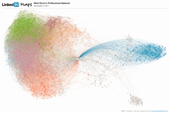
The interesting diagram included below is a visualization of my LinkedIn network. Â It represents the 1,220 contacts I have connected to via LinkedIn, since I joined as the 8,638th member of LinkedIn way back in 2003 or 2004.
The blue cluster in the upper right contains primarily contacts from the Arizona business community. Â The small cluster in the lower right corner contains contacts from Eyring Research Institute, the company where I spend the first dozen years of my career. Â The big, multi-colored cluster to the left grew from my interaction with Sun Identity Management and Telecommunications groups, with many people transitioning with me to Oracle or other companies, plus folks I have added since the Sun Acquisition.
You can get your own map at InMaps, from LinkedIn Labs.

